True Colours Restorations Pearl Business Card
David came to me to make his website happen. He already had his logo created and it has the three primary colours (red, blue, yellow) and silver chrome look so I played off of these elements while creating the brand. Then we moved on to business cards and had a lot of fun. We chose a sparkly pearl paper, rounded edges that are coloured blue. The client loves them and just ordered more!

Fresh Branding for a Long Standing Business
While working on contract at Print Pros Plus in Thunder Bay Ontario, Melanie worked with the Owner and his team to finalize this logo. Then moved on to updating their branding across the board. Choosing the font was the biggest and most important aspect of this project as the Business Owner was looking for just the right font to speak to him and we found it!

Tasty Oven, Tasty Design
This was obviously a super fun project! We worked on The Tasty Oven logo until we came up with just the right look and then designed the cards. We had so many great ideas and finally narrowed it down to this—the client is quite pleased and so are we.

Indoor Bike Park Member & Gift Cards
By the time we came on the EPIC scene, the logo had more or less been designed... we just tweaked it a little. Using a fun, thick font for "INDOOR BIKE PARK" and instead of using the huge, heavy photo of wood that was part of the original logo, we did a black & white version easier to use for printed collateral. The wood look was still used in a few spots. These cards were the start of many designs like this. Unfortunately, EPIC took a big chance in trying something new in Ottawa and while they were well received, were not able to make a go of it and closed December 2015.

Award Winning Home Builder
When Mark Kranenburg decided to start his own business, he came to us with a certain idea in mind of what his branding should communicate—a home builder of high quality and environmentally responsible. Since it's inception Greenmark Builders have gone on to build exceptional homes in the Ottawa area, winning some awards along the way.

Reaching Full Potential
Soul in Motion is a brand created by Lydia, a counsellor, coach, workshop facilitator and author of “Imagine: Using mental imagery to reach your full potential”. Lydia came to us to update her logo without drifting too far from her original designs. So we kept the dolphin, changed the fonts and colours. We went with the water flowing theme through-out her logo, cards, letterhead and website. See more

Realtor Business Card
Cheryl has been a long-time client and has this incredible entrepreneurial spirit being part of many ventures. When she came to me with the news she was going to be a Realtor I thought “well of course, that makes perfect sense!” We had to work especially hard on this card as there are many rules to follow when you work with a large company like ReMax. We are all happy with the outcome!


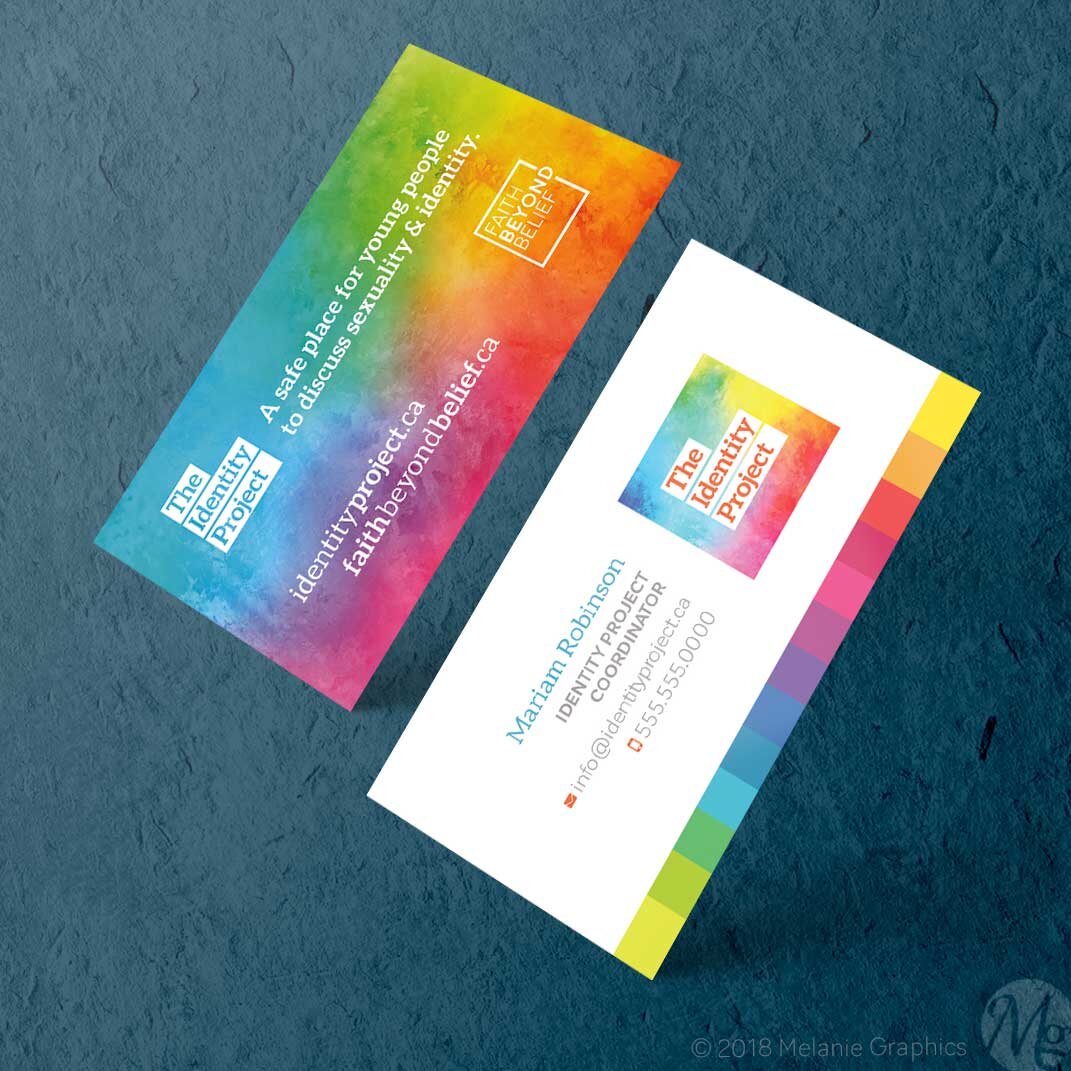
Safe Places for Youth
Cards for a project that can be run by any group wanting to create safe places for youth and adults to learn about their identity in Christ and discuss sexuality as God designed. Names and numbers have been altered for privacy to the client.

Cleaning Services
We wanted to stress the purpose of the service offered is to lend a helping hand to busy moms and dads who need some extra help around the house. So we chose the octopus to highlight EXTRA HANDS in a fun, cute way. Then we played on that theme with a font that also has scrolling lines. The broom was added to further the cleaning theme.

Home Business Branding
We were sent a scan of a rough sketch of a tree idea the client had. Using that as inspiration we drew our own tree with ink, then using some new technology we captured the illustration using Adobe software on the iPad and then finished the design in Illustrator.

Dental Lab Branding
Sean Hanrahan is an Artist! He meticulously crafts each tooth and is passionate about the artistry behind what he does. We wanted to reflect this in his branding. Sean had a number of excellent ideas to start us off and this is the final outcome. His cards are printed on a linen stock to give it a time-less, refined appearance.

Book Shop Cards
The first rendition was gold & burgandy on a spotted, warm-toned paper with a colourized photo of a mural of Toronto. The Client wanted to update this look and we went for a black & white card with 1 spot colour for a bold look. We drew the mural instead for a crisp digital illustrative style.

Praetor Group Branding
This was a start-up business looking to build a new brand based on the latin word "praetor" which represents a Roman army leader. The card design is professional and subtle to allow the metallic paper to shine through.

Celtic Feel
The Client wanted to use this celtic symbol somehow within the logo. This is the first rendition of the cards. Due to the similarities to a gothic window you might find in an old church, the second run of cards we printed had a different, more simple design.

Second Run
The Client was happy with the logo but felt we needed a simpler design for the business cards. Here's what we came up with. This design put emphasis on the message, using a child-like font to highlight services designed to help children with learning challenges.

Branding for a Life Coach
With Sophie, I learned that for those whose businesses are based around themselves, not just a product or service, their brand is very personal. As a designer, I came up with some really cool options that got rejected because they just weren't her... after talking about it and trying a few options, we came up with this design which she felt was perfect for her!

Designer Jewelry, Colourful Brand
Jenn's Jems designs stunning jewelry and needed business cards for the shows and private parties. The logo and original card were done a number of years ago. This card is a recent update where we used new fonts for a fresh look.

Logo & Card Design
The owners of this high-tech start-up wanted a name that meant something so they chose Petra to represent not only his name (Peter) but that idea of building a company on a solid foundation. This design even 8 years later, still looks great (we might be slightly biased here...)

Bookstore Gift Cards
A simple design for Mount Saint Vincent University Bookstore in Halifax. The back has some legal text and bar code. These gift cards are made from a sturdy plastic much like your credit card.

Handyman Business Cards
Easiest client to work with ever! My husband was a contractor / handy-man for many years before becoming a pilot. Since he had been working with his father and his father went by “handyman”, we thought, why not “handy-guy” to be a little different.


